1. The first header I found I really liked because it was very theme oriented. I liked the way the header matched the template in the sense of an old back in the day look they had.
http://www.flickr.com/photos/splat/59000967/in/set-981332/
2. I liked this header mainly because of its' simplicity. It is very simple, yet it is very appropriate for their blog.
http://gizmodo.com/
3. Again, this one is very simple, but it is very appropriate for the website. It is a designer web page, so you are going to want to show text and template that are clean and clear.
http://www.flickr.com/photos/splat/427211703/in/set-981332/
Tuesday, October 21, 2008
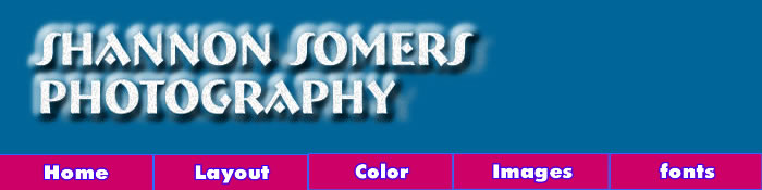
New Fonts
I used a font called "Bremen bd BT" and I actually had this font on my computer. I downloaded some fonts and played around with them, but in the end, I really enjoyed how this font appeared with went with my vision. I used a dropped shadow, an inner glow, raised emboss, added noise, and I changed the hue and saturation of the text image as well. I added noise just for a little bit of texture to the text.
Monday, October 13, 2008
More Images from other Sites
1. http://l.yimg.com/g/images/spaceball.gif
First, I found this .gif image of a girl holding a camera because I thought that was appropriate for me.
2. http://farm1.static.flickr.com/135/343505893_e6ca566ec8.jpg?v=0\
Next, I found this .jpeg image of a portrait of this girl just because I love people and pictures of them.. soo..
3. http://farm1.static.flickr.com/107/302549981_27fc2fb921.pmg?v=0
I found it harder to find the png files. So this picture is okay, it was one of the only png files I could find.
One More Image

Here is one more image for now that I was playing with the border for awhile and this is the best I could come up with for now. I think I should come back to it another day cause I think it could be better.
Optimized JPEG 2

Here is another picture from the same series. The first image is optimized to a JPEG with better quality. I optimized tgis photograph to a GIF 256. I know it is a bigger file, but being a photographer, I like the best quality for my images to be seen, so I wanted all the colors in there.
Optimized JPEG Image

I figured since I am a photographer I would put up some of my work. So I chose these series of pictures of this one male model I had that went along with th background, atleast way more than my other images.
Tuesday, October 7, 2008
Color Schemes
I chose purple to start with because purple is my favorite color and I wanted to use something with a little more color than black. I really enjoy complimentary colors. I feel that they are the most pleasing to the eye so therefore I went with purple's complimentary color, yellow. I used many different shades of both the purple and the yellow. Having the yellow as the writing and the purple for the back brings alot of contrast and makes the light writing on the dark background really pop.
Monday, October 6, 2008
Dark Poke-a-dots
This layout I chose firstly because it was one of the only dark templates and I like darker colors rather than just plain white. Although it does have dots all over, I still think it looks pretty clean and highlights the content in the layout with the lighter colors on the darker background. This layout has 2 columns with 1/3 on left side and 2/3 ont the right side. Two columns I think is plenty because it doesnt look crowded. All the colors seem to contrast eachother well, but that could just be me.. I'm not sure.
Wednesday, October 1, 2008
Alter Ego
My favorite website would probably be Alter Ego. It is a fetish photography website that updates you of fetish galleries going on. I am a fetish photographer so I enjoy going to that website and checking out other fetish photography as well. I probably visit that site about twice a week or more. I like that it has alot of conent and links to othe photographers and artist.
Hello!
Hi! My name is Shannon and I am 21 years old. I graduated with a Bachelor's degree in Proffessional Photography from Brooks Institute. I am currently taking this class so that I can build a website for my photography because portfolios seem to becomming less and less wanted. Everyone wants to see your website, so I figure I could build my website while deferring my student loans. I am very much looking forward to learning how to design my website.
:)
:)
Subscribe to:
Posts (Atom)
